How to Create a Responsive Dashboard with Side Navigation and Dark Theme Toggle
Introduction to Responsive Dashboard Design
In modern web development, creating a responsive dashboard with an intuitive user interface is essential for providing a seamless user experience across devices. Whether you’re building an admin panel, a project management tool, or a personal portfolio, a well-structured dashboard with a side navigation bar, top menu, and dark theme toggle can significantly enhance usability and aesthetics. In this blog post, we’ll walk you through the process of designing a responsive dashboard using HTML, CSS, and JavaScript, complete with a search bar, dark mode toggle, and a right sidebar for additional functionality

 View live demo
Why Build a Responsive Dashboard?
A responsive dashboard design ensures that your web application looks and functions perfectly on desktops, tablets, and mobile devices. Key benefits include:
- Improved User Experience: A side navigation bar provides easy access to different sections of your app.
- Dark Theme Support: Adding a dark theme toggle improves accessibility and reduces eye strain for users.
- Search Functionality: A search bar in the top menu helps users quickly find content.
- Cross-Device Compatibility: Responsive design ensures your dashboard works on all screen sizes.
Step 1: Set Up the HTML Structure
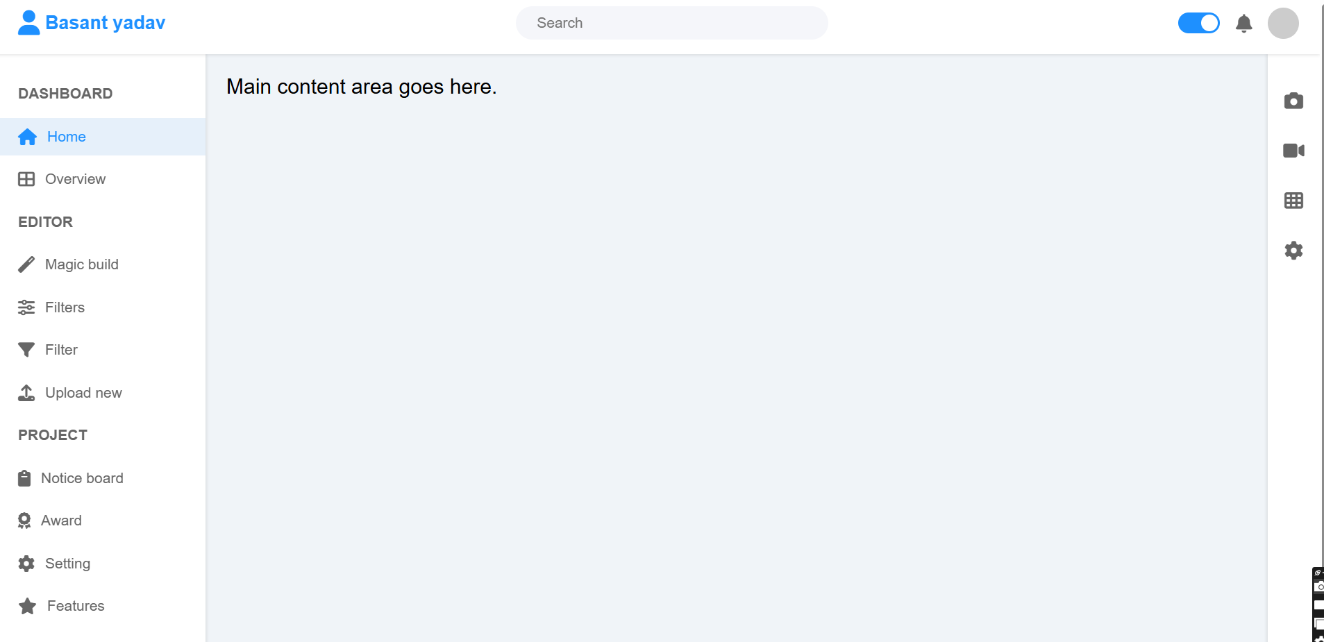
The foundation of our dashboard includes a top navigation bar, a left sidebar, a right sidebar, and a main content area. Here’s the basic HTML structure:
<header class="top-nav"> <div class="logo"> <i class="fas fa-code"></i> CodingNepal </div> <div class="search-bar"> <input type="text" placeholder="Search"> </div> <div class="top-nav-right"> <label class="theme-toggle"> <input type="checkbox" id="theme-toggle-checkbox"> <span class="theme-toggle-slider"></span> </label> <i class="fas fa-bell"></i> <div class="profile-pic"></div> </div> </header> <button class="hamburger" onclick="toggleSidebar()"><i class="fas fa-bars"></i></button> <nav class="sidebar" id="sidebar"> <h3>Dashboard</h3> <ul class="nav-list"> <li><a href="#home" class="active"><i class="fas fa-home"></i> Home</a></li> <li><a href="#overview"><i class="fas fa-th-large"></i> Overview</a></li> </ul> <!-- Additional sidebar sections --> </nav> <aside class="right-sidebar"> <i class="fas fa-camera"></i> <i class="fas fa-video"></i> <i class="fas fa-th"></i> <i class="fas fa-cog"></i> </aside> <main class="main-content"> <p>Main content area goes here.</p> </main>
- Top Navigation Bar: Contains the logo, search bar, and a dark theme toggle switch.
- Side Navigation Bar: A fixed left sidebar with navigation links, collapsible on mobile.
- Right Sidebar: A narrow sidebar with icons for quick actions.
- Main Content: The primary area for displaying dashboard content.
Step 2: Style the Dashboard with CSS
We’ll use CSS to style the dashboard, ensuring it’s responsive and visually appealing. Key styles include:
- Top Navigation Bar: Fixed at the top with a shadow for depth.
- Side Navigation Bar: Fixed on the left, with hover effects on links.
- Dark Theme Toggle: A custom slider switch for toggling between light and dark modes.
- Responsive Design: Media queries to handle mobile layouts.
- Here’s a snippet of the CSS:
body {
font-family: Arial, sans-serif;
background: #f0f4f8;
min-height: 100vh;
transition: background 0.3s ease, color 0.3s ease;
}
body.dark-theme {
background: #1e252b;
color: #ecf0f1;
}
.top-nav {
position: fixed;
top: 0;
left: 0;
right: 0;
height: 60px;
background: #fff;
display: flex;
align-items: center;
justify-content: space-between;
padding: 0 20px;
box-shadow: 0 1px 3px rgba(0, 0, 0, 0.1);
z-index: 1000;
}
.search-bar {
background: #f5f6fa;
border-radius: 20px;
padding: 8px 20px;
width: 300px;
display: flex;
align-items: center;
}
.sidebar {
width: 200px;
height: calc(100vh - 60px);
background: #fff;
position: fixed;
left: 0;
top: 60px;
padding: 20px 0;
box-shadow: 1px 0 3px rgba(0, 0, 0, 0.1);
}
@media screen and (max-width: 768px) {
.sidebar {
transform: translateX(-200px);
}
.sidebar.active {
transform: translateX(0);
}
}Step 3: Add Interactivity with JavaScript
JavaScript handles the interactivity, including the sidebar toggle on mobile, dark theme toggle, and active navigation link highlighting. Here’s the key JavaScript code:
function toggleSidebar() {
const sidebar = document.getElementById('sidebar');
sidebar.classList.toggle('active');
}
function toggleTheme() {
document.body.classList.toggle('dark-theme');
}
document.addEventListener('DOMContentLoaded', function() {
const themeToggleCheckbox = document.getElementById('theme-toggle-checkbox');
themeToggleCheckbox.addEventListener('change', toggleTheme);
}); Complete code :
<!DOCTYPE html>
<html lang="en">
<head>
<meta charset="UTF-8">
<meta name="viewport" content="width=device-width, initial-scale=1.0">
<title>Dashboard Layout with Dark Theme Toggle</title>
<link rel="stylesheet" href="https://cdnjs.cloudflare.com/ajax/libs/font-awesome/6.4.0/css/all.min.css">
<style>
* {
margin: 0;
padding: 0;
box-sizing: border-box;
}
body {
font-family: Arial, sans-serif;
background: #f0f4f8;
min-height: 100vh;
transition: background 0.3s ease, color 0.3s ease;
}
body.dark-theme {
background: #1e252b;
color: #ecf0f1;
}
/* Top navigation bar */
.top-nav {
position: fixed;
top: 0;
left: 0;
right: 0;
height: 60px;
background: #fff;
display: flex;
align-items: center;
justify-content: space-between;
padding: 0 20px;
box-shadow: 0 1px 3px rgba(0, 0, 0, 0.1);
z-index: 1000;
transition: background 0.3s ease, color 0.3s ease;
}
.dark-theme .top-nav {
background: #2c333a;
box-shadow: 0 1px 3px rgba(0, 0, 0, 0.3);
}
.logo {
display: flex;
align-items: center;
font-size: 18px;
font-weight: bold;
color: #1e90ff;
}
.dark-theme .logo {
color: #66b0ff;
}
.logo i {
margin-right: 5px;
font-size: 24px;
}
.search-bar {
background: #f5f6fa;
border-radius: 20px;
padding: 8px 20px;
width: 300px;
display: flex;
align-items: center;
transition: background 0.3s ease;
}
.dark-theme .search-bar {
background: #3a4149;
}
.search-bar input {
border: none;
background: none;
outline: none;
width: 100%;
font-size: 14px;
color: #666;
}
.dark-theme .search-bar input {
color: #ecf0f1;
}
.dark-theme .search-bar input::placeholder {
color: #a0a6ad;
}
.top-nav-right {
display: flex;
align-items: center;
gap: 15px;
}
.top-nav-right i {
font-size: 18px;
color: #666;
cursor: pointer;
transition: color 0.3s ease;
}
.dark-theme .top-nav-right i {
color: #ecf0f1;
}
.profile-pic {
width: 30px;
height: 30px;
border-radius: 50%;
background: #ccc;
}
.dark-theme .profile-pic {
background: #666;
}
/* Theme toggle switch */
.theme-toggle {
position: relative;
display: inline-block;
width: 40px;
height: 20px;
}
.theme-toggle input {
opacity: 0;
width: 0;
height: 0;
}
.theme-toggle-slider {
position: absolute;
cursor: pointer;
top: 0;
left: 0;
right: 0;
bottom: 0;
background-color: #ccc;
transition: 0.4s;
border-radius: 20px;
}
.theme-toggle-slider:before {
position: absolute;
content: "";
height: 16px;
width: 16px;
left: 2px;
bottom: 2px;
background-color: white;
transition: 0.4s;
border-radius: 50%;
}
.theme-toggle input:checked + .theme-toggle-slider {
background-color: #1e90ff;
}
.theme-toggle input:checked + .theme-toggle-slider:before {
transform: translateX(20px);
}
/* Left sidebar */
.sidebar {
width: 200px;
height: calc(100vh - 60px);
background: #fff;
position: fixed;
left: 0;
top: 60px;
padding: 20px 0;
box-shadow: 1px 0 3px rgba(0, 0, 0, 0.1);
transition: transform 0.3s ease, background 0.3s ease;
}
.dark-theme .sidebar {
background: #2c333a;
box-shadow: 1px 0 3px rgba(0, 0, 0, 0.3);
}
.sidebar.hidden {
transform: translateX(-200px);
}
.sidebar h3 {
font-size: 14px;
color: #666;
padding: 10px 20px;
text-transform: uppercase;
transition: color 0.3s ease;
}
.dark-theme .sidebar h3 {
color: #a0a6ad;
}
.nav-list {
list-style: none;
}
.nav-list li {
margin: 5px 0;
}
.nav-list a {
display: flex;
align-items: center;
padding: 10px 20px;
color: #666;
text-decoration: none;
font-size: 14px;
transition: background 0.2s, color 0.3s ease;
}
.dark-theme .nav-list a {
color: #ecf0f1;
}
.nav-list a i {
margin-right: 10px;
font-size: 16px;
}
.nav-list a:hover {
background: #f5f6fa;
}
.dark-theme .nav-list a:hover {
background: #3a4149;
}
.nav-list a.active {
background: #e6f0fa;
color: #1e90ff;
}
.dark-theme .nav-list a.active {
background: #4a5159;
color: #66b0ff;
}
/* Right sidebar */
.right-sidebar {
position: fixed;
right: 0;
top: 60px;
width: 50px;
height: calc(100vh - 60px);
background: #fff;
display: flex;
flex-direction: column;
align-items: center;
padding: 20px 0;
box-shadow: -1px 0 3px rgba(0, 0, 0, 0.1);
transition: background 0.3s ease;
}
.dark-theme .right-sidebar {
background: #2c333a;
box-shadow: -1px 0 3px rgba(0, 0, 0, 0.3);
}
.right-sidebar i {
font-size: 18px;
color: #666;
margin: 15px 0;
cursor: pointer;
transition: color 0.3s ease;
}
.dark-theme .right-sidebar i {
color: #ecf0f1;
}
.right-sidebar i:hover {
color: #1e90ff;
}
.dark-theme .right-sidebar i:hover {
color: #66b0ff;
}
/* Main content */
.main-content {
margin-left: 200px;
margin-right: 50px;
margin-top: 60px;
padding: 20px;
min-height: calc(100vh - 60px);
transition: color 0.3s ease;
}
.dark-theme .main-content {
color: #ecf0f1;
}
/* Hamburger menu */
.hamburger {
display: none;
font-size: 24px;
background: none;
border: none;
color: #666;
padding: 15px;
cursor: pointer;
position: fixed;
top: 15px;
left: 10px;
z-index: 1001;
transition: color 0.3s ease;
}
.dark-theme .hamburger {
color: #ecf0f1;
}
/* Responsive design */
@media screen and (max-width: 768px) {
.sidebar {
transform: translateX(-200px);
}
.sidebar.active {
transform: translateX(0);
}
.main-content {
margin-left: 0;
margin-right: 0;
}
.right-sidebar {
display: none;
}
.hamburger {
display: block;
}
.search-bar {
width: 150px;
}
}
</style>
</head>
<body>
<header class="top-nav">
<div class="logo">
<i class="fas fa-user"></i>
Basant yadav
</div>
<div class="search-bar">
<input type="text" placeholder="Search">
</div>
<div class="top-nav-right">
<label class="theme-toggle">
<input type="checkbox" id="theme-toggle-checkbox">
<span class="theme-toggle-slider"></span>
</label>
<i class="fas fa-bell"></i>
<div class="profile-pic"></div>
</div>
</header>
<button class="hamburger" onclick="toggleSidebar()"><i class="fas fa-bars"></i></button>
<nav class="sidebar" id="sidebar">
<h3>Dashboard</h3>
<ul class="nav-list">
<li><a href="#home" class="active"><i class="fas fa-home"></i> Home</a></li>
<li><a href="#overview"><i class="fas fa-th-large"></i> Overview</a></li>
</ul>
<h3>Editor</h3>
<ul class="nav-list">
<li><a href="#magic-build"><i class="fas fa-magic"></i> Magic build</a></li>
<li><a href="#filters"><i class="fas fa-sliders-h"></i> Filters</a></li>
<li><a href="#filter"><i class="fas fa-filter"></i> Filter</a></li>
<li><a href="#upload-new"><i class="fas fa-upload"></i> Upload new</a></li>
</ul>
<h3>Project</h3>
<ul class="nav-list">
<li><a href="#notice-board"><i class="fas fa-clipboard"></i> Notice board</a></li>
<li><a href="#award"><i class="fas fa-award"></i> Award</a></li>
<li><a href="#setting"><i class="fas fa-cog"></i> Setting</a></li>
<li><a href="#features"><i class="fas fa-star"></i> Features</a></li>
</ul>
</nav>
<aside class="right-sidebar">
<i class="fas fa-camera"></i>
<i class="fas fa-video"></i>
<i class="fas fa-th"></i>
<i class="fas fa-cog"></i>
</aside>
<main class="main-content">
<p>Main content area goes here.</p>
</main>
<script>
function toggleSidebar() {
const sidebar = document.getElementById('sidebar');
sidebar.classList.toggle('active');
}
function toggleTheme() {
document.body.classList.toggle('dark-theme');
}
// Add event listener for theme toggle after DOM is loaded
document.addEventListener('DOMContentLoaded', function() {
const themeToggleCheckbox = document.getElementById('theme-toggle-checkbox');
themeToggleCheckbox.addEventListener('change', toggleTheme);
});
// Close sidebar when clicking outside on mobile
document.addEventListener('click', function(event) {
const sidebar = document.getElementById('sidebar');
const hamburger = document.querySelector('.hamburger');
if (window.innerWidth <= 768px && !sidebar.contains(event.target) && !hamburger.contains(event.target)) {
sidebar.classList.remove('active');
}
});
// Adjust main content margin when sidebar is toggled
window.addEventListener('resize', function() {
const mainContent = document.querySelector('.main-content');
if (window.innerWidth > 768px) {
mainContent.style.marginLeft = '200px';
mainContent.style.marginRight = '50px';
} else {
mainContent.style.marginLeft = '0';
mainContent.style.marginRight = '0';
}
});
// Add active class to clicked nav item
document.querySelectorAll('.nav-list a').forEach(link => {
link.addEventListener('click', function() {
document.querySelectorAll('.nav-list a').forEach(a => a.classList.remove('active'));
this.classList.add('active');
});
});
</script>
</body>
</html>
Table of Contents
Toggle