30+ Free Login & Registration Form Templates in HTML & CSS
A clean and attractive login or registration form plays a major role in creating a good first impression for any website. Whether you’re building an eCommerce site, portfolio, school project, admin dashboard, or mobile app UI, a well-designed form improves user experience and brand value.To make your work easier, here are 30+ free login and registration form templates built using pure HTML, CSS, and sometimes JavaScript. All templates are responsive, easy to customize, and ready to use.
Why Use Ready-Made Login & Registration Templates?
- Saves time during development
- Clean and modern UI
- Easy to integrate
- Fully responsive designs
- Works with any backend (PHP, Node, Django, Laravel, Firebase, etc.)
- Beginner-friendly and customizable
.
1. Simple Minimal Login Form (HTML & CSS)
A clean design with a centered form, perfect for basic websites and student projects.

- Features:
✔ Minimal UI
✔ Fully responsive
✔ Email + Password fields and Centered card layout
✔ Soft shadows
✔ Gradient background
✔ Clean input fields
✔ Hover animation
✔ Fully responsive
This is the most simple and perfect Login Form Design that I have created in HTML and CSS. As you can see in the given preview of this login form there is a title, some input fields for email or phone number and password with icons, a forget password and Signup link, and a button.To boost your skills in HTML and CSS, this Login Form could be really helpful for you. For the video tutorial and all the HTML and CSS source code for this Login Form, you can visit the given link.
2. Login Form with Floating Label Animation
I have created this Login Form using HTML and CSS. In this Login Form, I have added some extra features like the input field’s label-up animation while you focus on it, remember me checkbox, and, of course, the UI design.

This Login Form is also created using basic HTML and CSS code so you should try to learn to create this beautiful Login Form. While creating this Login, you will learn to give gradient colors on the Login Form and animation also. The video tutorial link and the source code link for this Login Form are given below.
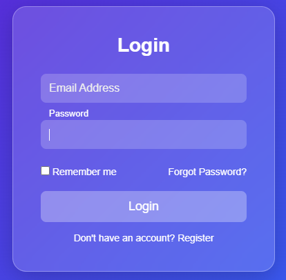
Login Form with Social Media Login Option

This modern login page is a fully responsive and visually appealing authentication interface built exclusively with HTML5 and CSS3. It features a sophisticated gradient background transitioning from deep purple to bright blue, creating an immersive visual experience. The login container employs a glassmorphism effect with semi-transparent white background and backdrop blur, giving it a contemporary, frosted-glass appearance. The design is both aesthetically pleasing and highly functional, with all form elements carefully structured for optimal user interaction. The interface includes a complete login form with email and password fields enhanced by Font Awesome icons, a “Remember Me” checkbox, and password visibility toggle indicator, along with social login buttons for Google, Facebook, and Twitter—each styled with their respective brand colors that transform on hover to provide clear visual feedback.
The implementation demonstrates advanced CSS techniques including smooth transitions, hover animations, and focus states that create an engaging user experience. Form elements feature subtle fade-in animations that sequentially appear, while buttons lift slightly on hover with accompanying shadow effects. The design is fully responsive, employing a mobile-first approach that gracefully adapts from smartphone screens to desktop displays. Accessibility considerations are integrated throughout, with proper semantic HTML structure, adequate color contrast ratios, and clear visual indicators for interactive elements. The color scheme utilizes a professional palette with blue and purple as primary colors, complemented by appropriate success (green) and error (red) states for form validation feedback. This standalone implementation requires no JavaScript or external dependencies beyond Font Awesome icons, making it lightweight and easily integrable into any web project while providing all the visual sophistication and functionality expected from a modern authentication interface.
- Watch Video Tutorial.
- Code given below
/* Reset & Base Styles */
* {
margin: 0;
padding: 0;
box-sizing: border-box;
}
body {
font-family: ‘Segoe UI’, Tahoma, Geneva, Verdana, sans-serif;
background: linear-gradient(135deg, #6a11cb 0%, #2575fc 100%);
display: flex;
justify-content: center;
align-items: center;
min-height: 100vh;
padding: 20px;
}
/* Login Container */
.login-container {
width: 100%;
max-width: 420px;
background: rgba(255, 255, 255, 0.95);
backdrop-filter: blur(10px);
border-radius: 16px;
padding: 40px 35px;
box-shadow: 0 15px 35px rgba(0, 0, 0, 0.2);
position: relative;
overflow: hidden;
transition: transform 0.3s ease;
}
.login-container:hover {
transform: translateY(-5px);
}
.login-container::before {
content: ”;
position: absolute;
top: 0;
left: 0;
width: 100%;
height: 5px;
background: linear-gradient(90deg, #6a11cb, #2575fc);
}
/* Header */
.login-header {
text-align: center;
margin-bottom: 35px;
}
.login-header h1 {
color: #2c3e50;
font-size: 32px;
font-weight: 700;
margin-bottom: 8px;
}
.login-header p {
color: #7f8c8d;
font-size: 15px;
font-weight: 400;
}
/* Form Styles */
.login-form {
margin-bottom: 30px;
}
.form-group {
margin-bottom: 24px;
position: relative;
}
.form-group label {
display: block;
margin-bottom: 8px;
color: #34495e;
font-size: 14px;
font-weight: 600;
text-transform: uppercase;
letter-spacing: 0.5px;
}
.input-with-icon {
position: relative;
}
.input-with-icon input {
width: 100%;
padding: 16px 16px 16px 48px;
border: 2px solid #e8e8e8;
border-radius: 10px;
font-size: 15px;
font-weight: 500;
color: #2c3e50;
background: #f9f9f9;
transition: all 0.3s ease;
}
.input-with-icon input:focus {
outline: none;
border-color: #3498db;
background: #fff;
box-shadow: 0 0 0 3px rgba(52, 152, 219, 0.1);
}
.input-with-icon input:focus + .input-icon {
color: #3498db;
transform: scale(1.1);
}
.input-icon {
position: absolute;
left: 16px;
top: 50%;
transform: translateY(-50%);
color: #95a5a6;
font-size: 18px;
transition: all 0.3s ease;
}
/* Password Toggle */
.password-toggle {
position: absolute;
right: 16px;
top: 50%;
transform: translateY(-50%);
background: none;
border: none;
color: #95a5a6;
cursor: pointer;
font-size: 16px;
padding: 5px;
transition: color 0.3s ease;
}
.password-toggle:hover {
color: #3498db;
}
/* Form Options */
.form-options {
display: flex;
justify-content: space-between;
align-items: center;
margin-bottom: 30px;
font-size: 14px;
}
.remember-me {
display: flex;
align-items: center;
gap: 8px;
}
.remember-me input[type=”checkbox”] {
width: 18px;
height: 18px;
cursor: pointer;
accent-color: #3498db;
}
.remember-me label {
color: #2c3e50;
cursor: pointer;
font-weight: 500;
}
.forgot-password {
color: #3498db;
text-decoration: none;
font-weight: 600;
transition: color 0.3s ease;
}
.forgot-password:hover {
color: #2980b9;
text-decoration: underline;
}
/* Submit Button */
.submit-btn {
width: 100%;
padding: 16px;
background: linear-gradient(135deg, #6a11cb 0%, #2575fc 100%);
color: white;
border: none;
border-radius: 10px;
font-size: 16px;
font-weight: 600;
cursor: pointer;
transition: all 0.3s ease;
display: flex;
justify-content: center;
align-items: center;
gap: 10px;
letter-spacing: 0.5px;
}
.submit-btn:hover {
transform: translateY(-2px);
box-shadow: 0 7px 20px rgba(106, 17, 203, 0.3);
}
.submit-btn:active {
transform: translateY(0);
}
.submit-btn i {
font-size: 18px;
}
/* Divider */
.divider {
display: flex;
align-items: center;
margin: 30px 0;
color: #95a5a6;
font-size: 14px;
font-weight: 500;
}
.divider::before,
.divider::after {
content: ”;
flex: 1;
height: 1px;
background: linear-gradient(90deg, transparent, #ddd, transparent);
}
.divider span {
padding: 0 20px;
}
/* Social Login */
.social-login {
display: flex;
flex-direction: column;
gap: 14px;
margin-bottom: 30px;
}
.social-btn {
padding: 14px;
border: 2px solid #e8e8e8;
border-radius: 10px;
background: white;
color: #2c3e50;
font-size: 15px;
font-weight: 600;
cursor: pointer;
display: flex;
justify-content: center;
align-items: center;
gap: 12px;
transition: all 0.3s ease;
}
.social-btn:hover {
transform: translateY(-2px);
border-color: #3498db;
box-shadow: 0 5px 15px rgba(0, 0, 0, 0.1);
}
.social-btn i {
font-size: 20px;
transition: transform 0.3s ease;
}
.social-btn:hover i {
transform: scale(1.1);
}
.social-btn.google {
border-color: #ea4335;
color: #ea4335;
}
.social-btn.google:hover {
background: #ea4335;
color: white;
}
.social-btn.facebook {
border-color: #1877f2;
color: #1877f2;
}
.social-btn.facebook:hover {
background: #1877f2;
color: white;
}
.social-btn.twitter {
border-color: #1da1f2;
color: #1da1f2;
}
.social-btn.twitter:hover {
background: #1da1f2;
color: white;
}
/* Sign Up Link */
.signup-link {
text-align: center;
color: #7f8c8d;
font-size: 15px;
margin-top: 25px;
}
.signup-link a {
color: #3498db;
text-decoration: none;
font-weight: 700;
margin-left: 5px;
transition: color 0.3s ease;
}
.signup-link a:hover {
color: #2980b9;
text-decoration: underline;
}
/* Loading Animation */
.submit-btn.loading {
pointer-events: none;
opacity: 0.9;
}
.submit-btn.loading::after {
content: ”;
display: inline-block;
width: 20px;
height: 20px;
border: 3px solid rgba(255, 255, 255, 0.3);
border-radius: 50%;
border-top-color: white;
animation: spin 1s linear infinite;
}
@keyframes spin {
to { transform: rotate(360deg); }
}
/* Responsive Design */
@media (max-width: 480px) {
.login-container {
padding: 30px 25px;
margin: 0 10px;
}
.login-header h1 {
font-size: 28px;
}
.login-header p {
font-size: 14px;
}
.form-options {
flex-direction: column;
align-items: flex-start;
gap: 15px;
}
.social-btn {
font-size: 14px;
padding: 16px 12px;
}
.social-btn i {
font-size: 18px;
}
.input-with-icon input {
padding: 14px 14px 14px 44px;
font-size: 14px;
}
.input-icon {
left: 14px;
font-size: 16px;
}
.password-toggle {
right: 14px;
font-size: 14px;
}
}
/* Animation for form groups */
.form-group {
animation: fadeInUp 0.5s ease forwards;
opacity: 0;
}
.form-group:nth-child(1) {
animation-delay: 0.1s;
}
.form-group:nth-child(2) {
animation-delay: 0.2s;
}
@keyframes fadeInUp {
from {
opacity: 0;
transform: translateY(20px);
}
to {
opacity: 1;
transform: translateY(0);
}
}
/* Error State */
.input-with-icon input.error {
border-color: #e74c3c;
background: #ffeaea;
}
.input-with-icon input.error:focus {
box-shadow: 0 0 0 3px rgba(231, 76, 60, 0.1);
}
.input-with-icon input.error + .input-icon {
color: #e74c3c;
}
/* Success State */
.input-with-icon input.success {
border-color: #2ecc71;
background: #e8f8ef;
}
.input-with-icon input.success + .input-icon {
color: #2ecc71;
}
Glassmorphism Effect Login Form in HTML
This login form showcases a modern glassmorphism design achieved entirely with HTML and CSS. Glassmorphism is a trending UI style that creates a frosted, translucent glass-like look, allowing the background and foreground elements to blend smoothly.
The form contains two input fields for Email and Password, a “Remember me” checkbox, a “Forgot password?” option, a login button, and a registration link. Each input field uses a floating-label animation, where the placeholder text shifts upward when the field is focused.