Creating a Dynamic Skills Bar with HTML, CSS, and JavaScript
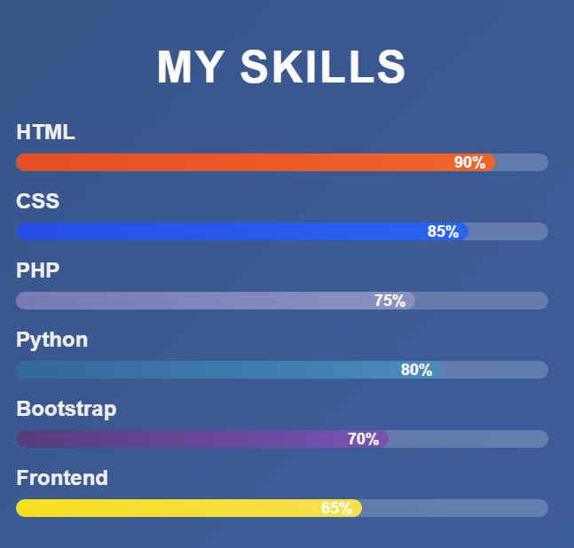
Showcasing your skills on a portfolio website can make a strong impression, and a visually appealing skills bar is a great way to do it. In this blog post, I’ll walk you through how to create an animated skills bar that displays proficiency levels for various technologies, complete with unique colors for each skill and a smooth loading animation. The skills we’ll highlight are HTML, CSS, PHP, Python, Bootstrap, and Frontend development.
Overview of the Project
The goal is to build a webpage that presents a set of skills with progress bars that animate from 0% to their respective proficiency levels when the page loads. Each skill has a distinct color gradient for its progress bar, making the display both functional and visually engaging. The layout is responsive, ensuring it looks great on both desktop and mobile devices.
Structuring the Content
The webpage uses a simple structure. A container holds a heading (“My Skills”) followed by individual skill sections. Each skill section consists of a label (e.g., “HTML”) and a progress bar. The progress bar is a container with a nested element that represents the skill level, which animates to the desired width.
Styling the Skills Bar
The styling is where the magic happens. Here’s how it’s done:
- Background and Layout: The body features a gradient background transitioning from a deep blue to a lighter shade, creating a modern look. The main container has a glassmorphism effect with a semi-transparent background and a blur filter, giving it a sleek, frosted appearance.
- Skill Bars: Each progress bar is a rounded rectangle with a subtle background to indicate the full width. The inner skill-level element starts at 0% width and animates to its target width (e.g., 90% for HTML) over 1.5 seconds with an ease-in-out transition for smoothness.
- Unique Colors: Each skill has a custom gradient:
- HTML: Orange shades (#e44d26 to #f16529)
- CSS: Blue shades (#264de4 to #2965f1)
- PHP: Purple shades (#777bb3 to #8892bf)
- Python: Blue-green shades (#306998 to #4b8bbe)
- Bootstrap: Deep purple shades (#563d7c to #7952b3)
- Frontend: Yellow shades (#f7df1e to #f4e04d)
- Percentage Display: The skill level percentage appears inside the progress bar, fading in as the animation completes for a polished effect.
- Responsive Design: Media queries adjust padding, font sizes, and layout for smaller screens, ensuring usability on mobile devices.
Animating with JavaScript
To make the skills bar dynamic, JavaScript handles the animation. When the page loads, a DOMContentLoaded event listener triggers the animation for each skill level. The script:
- Selects all skill-level elements.
- Iterates through them, applying a slight delay (200ms) between each to create a staggered effect.
- Sets the width of each skill-level element to its target width (defined in CSS as a custom property) and adds an
animateclass to fade in the percentage text.
This approach ensures the bars fill up sequentially, enhancing the visual appeal.
Key Features
- Smooth Animations: The 1.5-second transition with an ease-in-out timing function makes the progress bars grow naturally.
- Staggered Effect: The 200ms delay between each bar’s animation adds a professional touch.
- Custom Colors: Distinct gradients for each skill make the display vibrant and easy to differentiate.
- Responsive Layout: The design adapts seamlessly to various screen sizes.
- Glassmorphism: The container’s blurred, semi-transparent background gives a modern, trendy aesthetic.
comple code:
<!DOCTYPE html>
<html lang="en">
<head>
<meta charset="UTF-8">
<meta name="viewport" content="width=device-width, initial-scale=1.0">
<title>Skills Progress Bar</title>
<style>
body {
font-family: 'Arial', sans-serif;
background: linear-gradient(135deg, #1e3c72, #2a5298);
color: #fff;
margin: 0;
padding: 0;
display: flex;
justify-content: center;
align-items: center;
min-height: 100vh;
}
.container {
background: rgba(255, 255, 255, 0.1);
backdrop-filter: blur(10px);
border-radius: 15px;
padding: 40px;
width: 90%;
max-width: 600px;
box-shadow: 0 8px 32px rgba(0, 0, 0, 0.2);
}

h1 {
text-align: center;
font-size: 2.5em;
margin-bottom: 30px;
color: #fff;
text-transform: uppercase;
letter-spacing: 2px;
}

.skill {
margin-bottom: 20px;
}

.skill-name {
font-size: 1.2em;
margin-bottom: 10px;
font-weight: bold;
color: #f0f0f0;
}

.skill-bar {
background: rgba(255, 255, 255, 0.2);
border-radius: 25px;
height: 20px;
overflow: hidden;
position: relative;
}

.skill-level {
height: 100%;
border-radius: 25px;
width: 0; /* Start at 0 width for animation */
transition: width 1.5s ease-in-out;
position: relative;
}

.skill-level::after {
content: attr(data-level);
position: absolute;
right: 10px;
top: 50%;
transform: translateY(-50%);
color: #fff;
font-size: 0.9em;
font-weight: bold;
opacity: 0;
transition: opacity 0.3s ease-in-out;
}

.skill-level.animate::after {
opacity: 1;
}

/* Individual skill levels and colors */
.html {
--target-width: 90%;
background: linear-gradient(90deg, #e44d26, #f16529); /* HTML: Orange shades */
}
.css {
--target-width: 85%;
background: linear-gradient(90deg, #264de4, #2965f1); /* CSS: Blue shades */
}
.php {
--target-width: 75%;
background: linear-gradient(90deg, #777bb3, #8892bf); /* PHP: Purple shades */
}
.python {
--target-width: 80%;
background: linear-gradient(90deg, #306998, #4b8bbe); /* Python: Blue-green shades */
}
.bootstrap {
--target-width: 70%;
background: linear-gradient(90deg, #563d7c, #7952b3); /* Bootstrap: Deep purple shades */
}
.fontend {
--target-width: 65%;
background: linear-gradient(90deg, #f7df1e, #f4e04d); /* Frontend: Yellow shades */
}

@media (max-width: 600px) {
.container {
padding: 20px;
}

h1 {
font-size: 2em;
}

.skill-name {
font-size: 1em;
}
}
</style>
</head>
<body>
<div class="container">
<h1>My Skills</h1>
<div class="skill">
<div class="skill-name">HTML</div>
<div class="skill-bar">
<div class="skill-level html" data-level="90%"></div>
</div>
</div>
<div class="skill">
<div class="skill-name">CSS</div>
<div class="skill-bar">
<div class="skill-level css" data-level="85%"></div>
</div>
</div>
<div class="skill">
<div class="skill-name">PHP</div>
<div class="skill-bar">
<div class="skill-level php" data-level="75%"></div>
</div>
</div>
<div class="skill">
<div class="skill-name">Python</div>
<div class="skill-bar">
<div class="skill-level python" data-level="80%"></div>
</div>
</div>
<div class="skill">
<div class="skill-name">Bootstrap</div>
<div class="skill-bar">
<div class="skill-level bootstrap" data-level="70%"></div>
</div>
</div>
<div class="skill">
<div class="skill-name">Frontend</div>
<div class="skill-bar">
<div class="skill-level fontend" data-level="65%"></div>
</div>
</div>
</div>

<script>
document.addEventListener('DOMContentLoaded', () => {
const skillLevels = document.querySelectorAll('.skill-level');
skillLevels.forEach((level, index) => {
setTimeout(() => {
level.style.width = getComputedStyle(level).getPropertyValue('--target-width');
level.classList.add('animate');
}, index * 200);
});
});
</script>
</body>
</html>
How to Use It
To implement this skills bar, create a webpage with the necessary HTML structure, apply the CSS for styling and animations, and include the JavaScript for dynamic loading. Adjust the skill names, proficiency levels, and colors to match your expertise. You can also tweak the animation duration or delay for a different feel.
Conclusion
This skills bar is a fantastic addition to any portfolio website, combining functionality with a visually stunning presentation. The animated progress bars, unique color schemes, and responsive design make it both engaging and professional. Whether you’re showcasing coding skills or other expertise, this approach is versatile and easy to customize. Try it out, and let your skills shine!